Why Blog Image Optimization Deserves Your Attention#
Images account for 60–80% of the total payload on most technical blogs. A 3,000-word article compresses to roughly 8–12KB after gzip. A handful of diagrams and a cover image, meanwhile, routinely exceed 2MB. The asymmetry is stark — and it shows up directly in Core Web Vitals.
Largest Contentful Paint (LCP) is almost always the largest above-the-fold image. When LCP exceeds 2.5 seconds, Google applies a negative ranking signal. The good news: blog image optimization has one of the highest ROI-to-effort ratios in web performance. Configure the pipeline once, and every subsequent article benefits automatically.
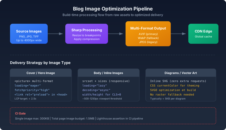
Cover Image Optimization#
The cover image is the single most important image on any article page. It is the LCP candidate roughly 80% of the time, so every decision about how it's delivered matters.
Constrain the Maximum Width#
Blog content columns rarely exceed 680–900px. A 4000px-wide source image is overkill by a factor of 4–6x. Even accounting for 2x Retina displays, there is no reason to serve a cover image wider than 1400px:
js1const sharp = require('sharp');2 3async function optimizeCover(inputPath) {4 const MAX_WIDTH = 1400;5 6 await sharp(inputPath)7 .resize({ width: MAX_WIDTH, withoutEnlargement: true })8 .avif({ quality: 55 })9 .toFile('output-cover.avif');10 11 await sharp(inputPath)12 .resize({ width: MAX_WIDTH, withoutEnlargement: true })13 .webp({ quality: 78 })14 .toFile('output-cover.webp');15}
The <picture> Element for Multi-Format Delivery#
html1<picture>2 <source srcset="/blog/my-post/cover.avif" type="image/avif" />3 <source srcset="/blog/my-post/cover.webp" type="image/webp" />4 <img5 src="/blog/my-post/cover.jpg"6 alt="Article cover image description"7 width="1200"8 height="630"9 loading="eager"10 fetchpriority="high"11 />12</picture>
Three critical details here:
-
loading="eager"— The cover image is the LCP candidate. Applyingloading="lazy"forces the browser to parse JavaScript and run layout before it can determine whether the image is in the viewport. That delay, typically 200–500ms on a mid-range device, goes straight onto your LCP score. -
fetchpriority="high"— Browsers assign a default fetch priority of Low to images.fetchpriority="high"bumps the cover image into the same priority tier as the main CSS file, ensuring it doesn't queue behind lower-priority resources. -
Explicit
widthandheight— Without these, the browser cannot reserve layout space before the image loads. The resulting layout shift (CLS) is not just annoying — it's a metric Google tracks.
Preloading When the Cover Isn't First in the DOM#
<img> before the cover, add a preload hint to the <head>:html1<link2 rel="preload"3 as="image"4 href="/blog/my-post/cover.avif"5 imagesrcset="6 /blog/my-post/cover-700.avif 700w,7 /blog/my-post/cover-1400.avif 1400w8 "9 imagesizes="(max-width: 768px) 100vw, 1400px"10/>
imagesrcset and imagesizes attributes on the preload link ensure the browser picks the correct variant — without them, it fetches the href unconditionally, potentially downloading the 1400px version for a 375px-wide phone screen.Body Image Optimization#
Responsive Sizes for Inline Images#
Inline images — diagrams, screenshots, illustrations — should be served at dimensions matched to the content column, not the viewport:
js1async function generateInlineImage(inputPath, slug) {2 const widths = [400, 700, 1100];3 4 return Promise.all(widths.map((w) =>5 sharp(inputPath)6 .resize({ width: w, withoutEnlargement: true })7 .avif({ quality: 50 })8 .toFile(`public/blog/${slug}/inline-${w}.avif`)9 ));10}
The corresponding markup:
html1<img2 srcset="3 /blog/my-post/inline-400.avif 400w,4 /blog/my-post/inline-700.avif 700w,5 /blog/my-post/inline-1100.avif 1100w6 "7 sizes="(max-width: 768px) calc(100vw - 32px), 700px"8 src="/blog/my-post/inline-700.avif"9 alt="Code architecture diagram"10 loading="lazy"11 decoding="async"12/>
decoding="async" tells the browser it can decode this image off the main thread. For images below the fold, this avoids competing with more critical rendering work.The Perceptual Inflection Point#
Every format has a quality parameter beyond which file size grows rapidly but perceived quality barely improves. This is the "perceptual inflection point" — the optimal trade-off where you stop gaining visible quality for the bytes you're spending:
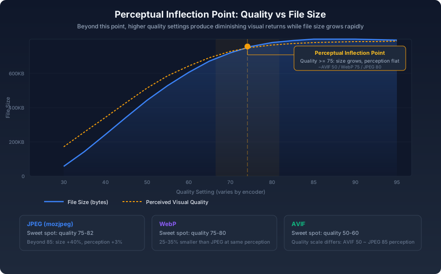
For inline blog images, the inflection points are:
- AVIF: quality 48–55
- WebP: quality 72–78
- JPEG (mozjpeg): quality 75–82
The curve above shows why this matters: moving AVIF quality from 50 to 70 increases file size by roughly 60% while improving perceived quality by less than 5%. That's a bad trade — especially when the image is one of ten on the page.
Lazy Loading Done Right#
Native lazy loading covers 96%+ of browsers today. There's no need for a JavaScript library:
html1<img src="diagram.avif" loading="lazy" alt="Architecture diagram" />
The browser's lazy-loading threshold is approximately 500–1250px beyond the viewport (the exact distance varies by implementation and effective connection type). This means images starting from the second screenful are deferred until they're about to become visible.
For the small fraction of browsers that don't support native lazy loading, a tiny conditional polyfill suffices:
js1if ('loading' in HTMLImageElement.prototype === false) {2 const script = document.createElement('script');3 script.src = 'https://cdn.jsdelivr.net/npm/lozad@1/dist/lozad.min.js';4 script.onload = () => { new Lozad('.lazy').observe(); };5 document.head.appendChild(script);6}
The feature detection means 96%+ of your visitors never download this polyfill.
LCP Decision Flow#
Not every image on the page should be treated equally. The loading strategy should vary by position and role:
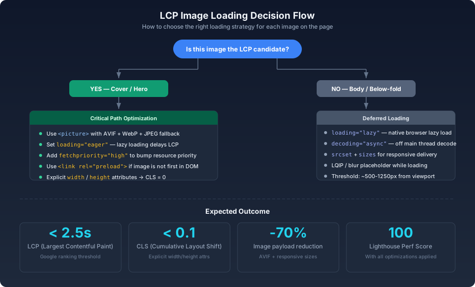
The decision tree breaks down into three categories:
| Image Role | Loading | Priority | Preload |
|---|---|---|---|
| Cover / hero (LCP candidate) | eager | high | Yes, in <head> |
| Above-fold but not LCP | eager | default | No |
| Below-fold / body | lazy | default | No |
Build-Time Automation#
Next.js Integration#
tsx1// next.config.js2module.exports = {3 images: {4 formats: ['image/avif', 'image/webp'],5 deviceSizes: [400, 700, 1100, 1400],6 imageSizes: [16, 32, 48, 64, 96, 128, 256],7 },8};
next/image component provides format negotiation and responsive sizing automatically:tsx1import Image from 'next/image';2 3export function BlogImage({ src, alt }: { src: string; alt: string }) {4 return (5 <Image6 src={src}7 alt={alt}8 width={1100}9 height={618}10 sizes="(max-width: 768px) 100vw, 700px"11 loading="lazy"12 placeholder="blur"13 />14 );15}
blur placeholder to work, you need a blurDataURL — generate it at build time using plaiceholder, which produces a 10px-wide thumbnail encoded as a base64 data URI. The cost is roughly 200–400 bytes per image, which is negligible compared to the UX improvement of a zero-CLS placeholder.Non-Framework Build Scripts#
json1{2 "scripts": {3 "optimize-images": "node scripts/optimize-blog-images.mjs",4 "build": "npm run optimize-images && next build"5 }6}
Vector Graphics for Diagrams#
Architecture diagrams, flowcharts, and schematics should be SVG. Inline SVG requires zero extra requests and can be styled with CSS:
html1<svg viewBox="0 0 600 400" class="diagram">2 <rect x="20" y="20" width="200" height="80" rx="8" fill="var(--color-surface)" />3</svg>
For external SVG files, run them through SVGO before shipping:
bash
currentColor and CSS custom properties allow diagrams to respond to theme changes without separate assets for light and dark modes.Performance Budgets and CI Gates#
Enforce image size budgets in CI. A single oversized image should fail the build:
yaml1# .github/workflows/image-budget.yml2- name: Check image sizes3 run: |4 oversized=$(find public/blog -type f \( -name "*.jpg" -o -name "*.png" \) -size +300k)5 if [ -n "$oversized" ]; then6 echo "Images exceeding 300KB budget:"7 echo "$oversized"8 exit 19 fi
Set 300KB as the per-image ceiling — exceptions should be rare and documented. Keep total page image payload under 1.5MB, which corresponds to roughly 3 seconds of load time on a typical 4G connection.
Bringing It Together#
<picture> with AVIF, WebP, and JPEG fallback, loading="eager", fetchpriority="high", and a preload hint if it isn't the first image in the DOM. Body images should use srcset with sizes, loading="lazy", decoding="async", and explicit width and height attributes to prevent layout shifts. Diagrams belong in SVG — inline where practical, optimized with SVGO otherwise. A per-image size budget enforced in CI keeps the page payload under control, and a build pipeline that auto-generates multi-format, multi-size variants means these optimizations apply to every article without manual intervention.Run Lighthouse after implementing these changes. The LCP improvement on image-heavy article pages should be measurable — commonly 40–60%.