Why Responsive Images Exist#
A desktop layout might call for a 1200px-wide hero image. A tablet layout, 768px. A phone, 390px. If you serve a single image for all three:
- Serve the large one and mobile users download 3–4x more data than their screen can display
- Serve the small one and desktop users see a blurred, upscaled mess
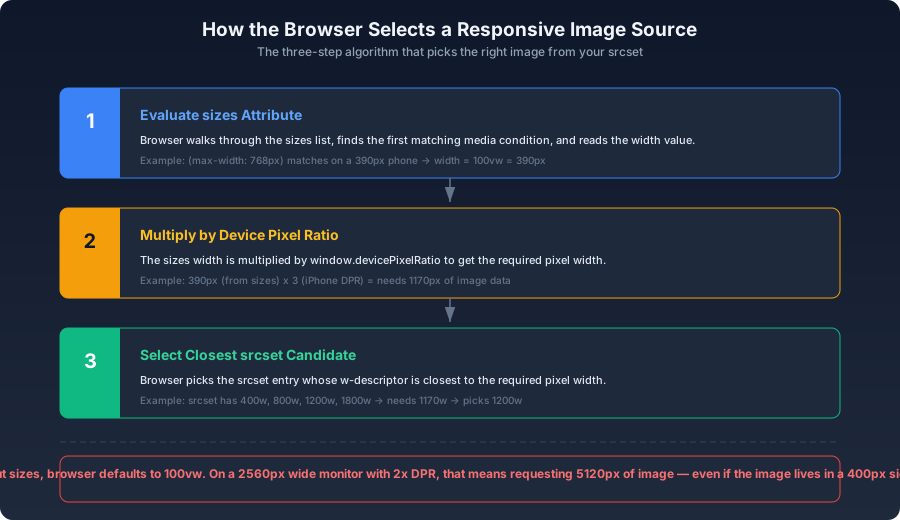
Responsive images let the browser choose the right source based on the rendered size and the device's pixel density. The markup tells the browser what sizes are available and how much space the image occupies in the current layout. The browser does the math.
srcset with Width Descriptors#
The DPR-Only Syntax (and Why It's Limited)#
html1<img2 src="photo.jpg"3 srcset="photo.jpg 1x, photo@2x.jpg 2x, photo@3x.jpg 3x"4 alt="Description"5/>
devicePixelRatio. A 2x Retina phone and a 2x Retina desktop both get photo@2x.jpg — even though the phone's viewport is 390px wide and the desktop is 1440px. The phone gets more pixels than it needs; the desktop gets fewer. DPR switching alone doesn't account for viewport size.The Width Descriptor (w) — The One You Want#
html1<img2 srcset="3 photo-400.jpg 400w,4 photo-800.jpg 800w,5 photo-1200.jpg 1200w6 "7 sizes="(max-width: 768px) 100vw, 800px"8 src="photo-800.jpg"9 alt="Description"10/>
400w, 800w, and 1200w descriptors tell the browser the intrinsic pixel width of each source file. The sizes attribute tells the browser how wide the image actually renders in the current layout. The browser uses both pieces of information to calculate how many pixels it needs, then picks the closest srcset entry.How sizes Works#
sizes is a list of media-condition-and-width pairs. The browser evaluates them in order and uses the first match:html1<img2 srcset="img-400.jpg 400w, img-800.jpg 800w, img-1200.jpg 1200w, img-1600.jpg 1600w"3 sizes="4 (max-width: 480px) calc(100vw - 32px),5 (max-width: 1024px) min(50vw, 600px),6 800px7 "8 src="img-800.jpg"9 alt="..."10/>
(max-width: 480px) matches. The width is calc(100vw - 32px) = 358px. The browser multiplies by DPR (let's say 3) = needs 1074px of image data. From srcset, the closest is 1200w.On a 1440px desktop: no conditions match. The default is 800px. With DPR 1, that's 800px needed. The browser picks 800w.
On a 1440px desktop with DPR 2: 800px x 2 = 1600px needed. The browser picks 1600w.
The No-sizes Trap#
html1<!-- Dangerous — no sizes, browser defaults to 100vw -->2<img srcset="img-400.jpg 400w, img-1200.jpg 1200w" src="img-800.jpg" />
sizes, the browser assumes the image fills the full viewport width. On a 2560px-wide monitor with DPR 2, the browser calculates 2560 x 2 = 5120px needed and picks the largest srcset entry — even if the image actually sits in a 300px sidebar. Always include sizes.picture: Art Direction and Format Negotiation#
Different Crops per Breakpoint#
html1<picture>2 <!-- Mobile: vertical crop -->3 <source media="(max-width: 768px)" srcset="hero-mobile.avif" />4 <!-- Desktop: horizontal crop -->5 <source media="(min-width: 769px)" srcset="hero-desktop.avif" />6 <img src="hero-desktop.jpg" alt="Hero" />7</picture>
media attribute works like a CSS media query.Format Negotiation#
html1<picture>2 <source srcset="photo.avif" type="image/avif" />3 <source srcset="photo.webp" type="image/webp" />4 <img src="photo.jpg" alt="Description" />5</picture>
<source> whose MIME type it can decode. AVIF-capable browsers get AVIF. WebP-only browsers get WebP. Everything else falls through to JPEG. No JavaScript, no server-side detection.The Full Combination#
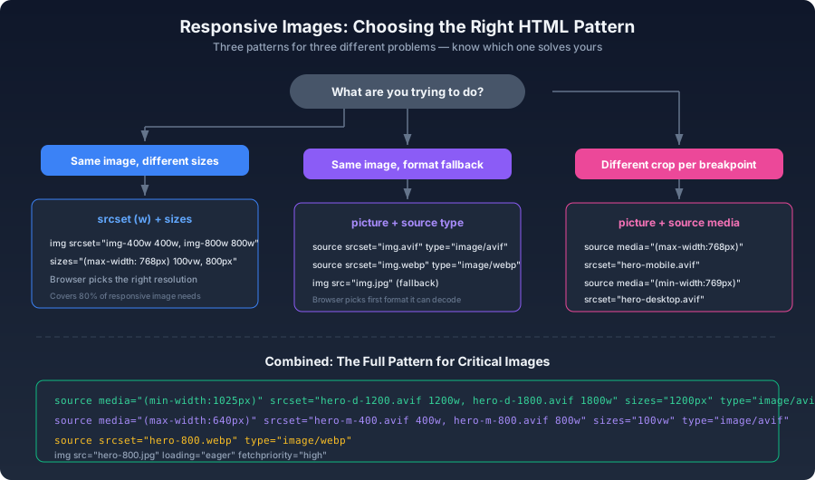
For high-value images — hero sections, product detail pages — combine all three patterns:
html1<picture>2 <!-- Desktop, AVIF, with srcset -->3 <source4 media="(min-width: 1025px)"5 srcset="hero-desktop-1200.avif 1200w, hero-desktop-1800.avif 1800w"6 sizes="1200px"7 type="image/avif"8 />9 <!-- Mobile, AVIF, with srcset -->10 <source11 media="(max-width: 640px)"12 srcset="hero-mobile-400.avif 400w, hero-mobile-800.avif 800w"13 sizes="100vw"14 type="image/avif"15 />16 <!-- WebP fallback -->17 <source18 srcset="hero-800.webp 800w"19 sizes="100vw"20 type="image/webp"21 />22 <!-- Ultimate fallback -->23 <img src="hero-800.jpg" alt="Hero" loading="eager" fetchpriority="high" />24</picture>
The verbosity is real, but for a hero image that's loaded millions of times, the per-request savings compound dramatically.
Generating Responsive Variants#
js1const sharp = require('sharp');2 3const SIZES = [400, 800, 1200, 1800];4 5async function generateSrcSet(inputPath, outputPrefix) {6 for (const width of SIZES) {7 await sharp(inputPath)8 .resize({ width, withoutEnlargement: true })9 .avif({ quality: 52 })10 .toFile(`${outputPrefix}-${width}.avif`);11 12 await sharp(inputPath)13 .resize({ width, withoutEnlargement: true })14 .webp({ quality: 78 })15 .toFile(`${outputPrefix}-${width}.webp`);16 }17}
A helper function to generate the markup:
js1function srcset(basePath, sizes) {2 return sizes.map((w) => `${basePath}-${w}.avif ${w}w`).join(', ');3}4 5function pictureHTML(basePath) {6 const imgSizes = [400, 800, 1200];7 return `8<picture>9 <source srcset="${srcset(basePath, imgSizes)}" sizes="(max-width: 768px) 100vw, 800px" type="image/avif" />10 <source srcset="${srcset(basePath + '-webp', imgSizes)}" sizes="(max-width: 768px) 100vw, 800px" type="image/webp" />11 <img src="${basePath}-800.jpg" loading="lazy" alt="" width="800" height="600" />12</picture>`;13}
Common sizes Mistakes#
sizes, the browser assumes 100vw. On a wide monitor, this causes it to request the largest srcset entry regardless of the actual rendered size.sizes says 600px, the browser requests a larger image than needed. sizes is a layout promise to the browser — it must match reality.(max-width: 768px) 100vw, 800px is sufficient. For complex responsive layouts with multi-column grids at intermediate breakpoints, you may need more granular sizes values.Debugging srcset in DevTools#
<img>, and check the Properties tab for currentSrc — this is the source the browser actually selected. Or run this in the console:js1document.querySelectorAll('img').forEach((img) => {2 console.log({3 src: img.currentSrc || img.src,4 natural: `${img.naturalWidth} x ${img.naturalHeight}`,5 rendered: `${img.width} x ${img.height}`,6 });7});
natural (the pixel dimensions of the selected source) against rendered (the CSS pixel dimensions on screen). If natural is more than 2x rendered, your sizes value is likely too large or your srcset lacks a smaller variant.When Not to Bother#
Not every image needs the full responsive treatment:
- User avatars — typically 64–128px, a single 2x source covers all cases
- Small decorative icons — use SVG instead; resolution-independent by nature
- Images in fixed-size containers — their rendered size doesn't change across breakpoints, so a single source at 2x the CSS size is enough
<img> with a 2x-resolution source handles the job without the complexity of srcset.When your image's rendered size changes with the viewport — hero sections, content-column images, product gallery photos — srcset and sizes earn their keep immediately. The browser does the math on every page load; you only write the markup once.