LCP Failing? Look at Your Images First#
According to the HTTP Archive, the median page's image payload is roughly 900KB on desktop and 700KB on mobile. For image-heavy sites — photography portfolios, ecommerce catalogs, travel blogs — that number routinely hits 3–5MB. Google's Chrome User Experience Report (CrUX) shows that images are the LCP element roughly 40–45% of the time. If your LCP is over 2.5 seconds, the largest image on the page is the place to start.
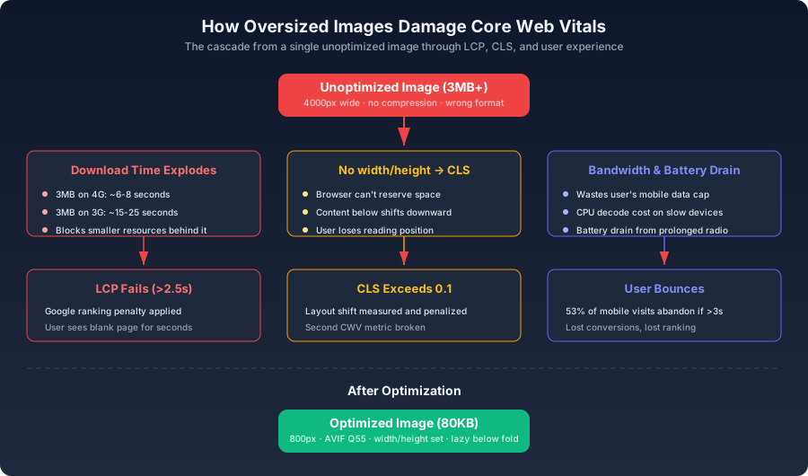
width and height attributes, the browser also cannot reserve layout space — so when the image finally arrives, it shoves the content below it downward. The page suffers a layout shift. Two Core Web Vitals, broken by a single file.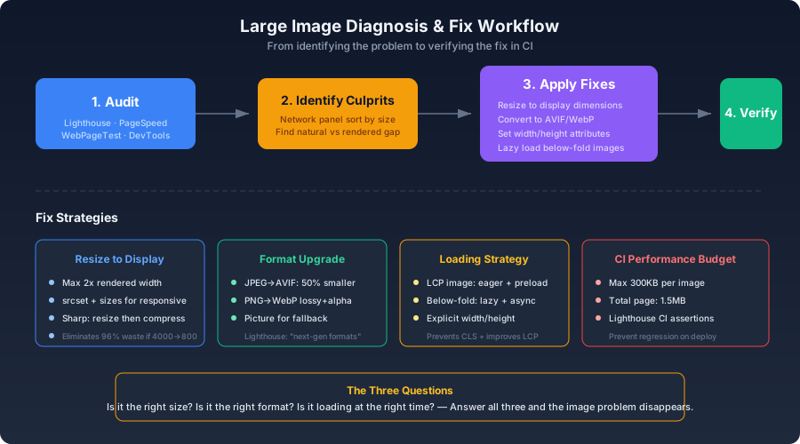
Diagnosing the Problem#
DevTools Network Panel#
The fastest way to find your worst images:
- Open the Network panel
- Sort by the Size column, descending
- Check "Disable cache"
- Reload the page
The waterfall tells you everything: when each image request was initiated, how long the server took to respond (TTFB), and how long the download took. If the largest image is also one of the earliest requests, it's your LCP candidate. If it takes longer than 2.5 seconds from request start to render, you've found the bottleneck.
WebPageTest for Real-World Conditions#
Lighthouse runs locally with simulated throttling. WebPageTest runs on real devices on real connections:
bash1curl -X POST "https://www.webpagetest.org/runtest.php?url=https://example.com&f=json&location=Dulles_MotoG4&runs=3"
The Filmstrip view shows frame-by-frame how the page renders. A large image's impact is unmistakable — the page stays blank or partial for several frames, then the image paints and everything below it shifts.
Automated CI Auditing with Puppeteer#
js1const puppeteer = require('puppeteer');2 3async function auditPageImages(url) {4 const browser = await puppeteer.launch();5 const page = await browser.newPage();6 7 const imageRequests = [];8 page.on('response', async (response) => {9 if (response.request().resourceType() === 'image') {10 const buffer = await response.buffer();11 imageRequests.push({12 url: response.url(),13 size: buffer.length,14 type: response.headers()['content-type'],15 });16 }17 });18 19 await page.goto(url, { waitUntil: 'networkidle0' });20 await browser.close();21 22 const top5 = imageRequests.sort((a, b) => b.size - a.size).slice(0, 5);23 for (const img of top5) {24 console.log(`${(img.size / 1024).toFixed(1)}KB — ${img.url}`);25 }26 27 const oversized = imageRequests.filter((i) => i.size > 200 * 1024);28 if (oversized.length > 0) {29 console.warn(`${oversized.length} images exceed 200KB budget`);30 }31}
This script identifies which specific images need attention and whether any violate a size budget. Run it in CI to catch regressions before they ship.
The Natural-vs-Rendered Gap#
The most common waste pattern: a 4000px-wide image displayed in an 800px-wide container. That's roughly 25 times more pixel data than necessary. Check this directly in the browser console:
js1document.querySelectorAll('img').forEach((img) => {2 const ratio = (img.naturalWidth * img.naturalHeight) / (img.width * img.height);3 if (ratio > 4) {4 console.warn(`Waste: ${img.src}`, {5 natural: `${img.naturalWidth}×${img.naturalHeight}`,6 rendered: `${img.width}×${img.height}`,7 wasteFactor: ratio.toFixed(1) + 'x',8 });9 }10});
A waste factor above 4 means the image is being served at more than 4x the needed pixel count. The fix is resizing, not more aggressive compression — you're shipping pixels the user can't see.
The Fix Strategies#
Strategy 1: Resize to Display Dimensions#
If an image renders at 800px CSS width, a 1600px source covers 2x Retina displays. Anything beyond that is wasted. Generate the right sizes:
bash1npx sharp-cli -i ./images/*.jpg -o ./optimized/ --avif '{"quality":55}'
Strategy 2: Format Conversion#
JPEG to AVIF typically saves 50% at equivalent visual quality. PNG with transparency to WebP lossy+alpha saves 60–80%. These are not marginal gains — for a site with 100MB of JPEG images, the AVIF versions total roughly 50MB. That's 50MB not transferred on every full page load.
Strategy 3: Loading Strategy by Position#
html1<!-- Above fold, LCP candidate: load immediately -->2<img src="hero.avif" loading="eager" fetchpriority="high" />3 4<!-- Below fold: defer everything -->5<img src="inline-1.avif" loading="lazy" decoding="async" />
eager with fetchpriority="high". Everything else gets lazy. There is no middle ground.Strategy 4: Responsive srcset#
html1<img2 srcset="3 /img/photo-400.avif 400w,4 /img/photo-800.avif 800w,5 /img/photo-1200.avif 1200w6 "7 sizes="8 (max-width: 640px) calc(100vw - 32px),9 (max-width: 1024px) 640px,10 800px11 "12 src="/img/photo-800.avif"13 alt="..."14/>
sizes attribute is not optional. Without it, the browser defaults to 100vw and selects a source based on the full viewport width — which on a wide desktop monitor means the largest variant, even if the image only occupies a 600px sidebar.Performance Budgets in CI#
Automated checks prevent the problem from recurring:
js1// lighthouse.config.js2module.exports = {3 ci: {4 assert: {5 assertions: {6 'resource-summary:image:size': ['error', { maxNumericValue: 500000 }],7 'largest-contentful-paint': ['error', { maxNumericValue: 2500 }],8 'total-byte-weight': ['error', { maxNumericValue: 1500000 }],9 },10 },11 },12};
json1{2 "scripts": {3 "lighthouse": "lhci autorun"4 }5}
A failed Lighthouse assertion blocks the deploy. The budget becomes a gate, not a suggestion.
Closing the Loop#
fetchpriority="high" for the LCP candidate, lazy with decoding="async" for everything below the fold. Add explicit width and height attributes to eliminate CLS. Encode all of this into a CI performance budget that fails the build when someone commits an oversized image. Once the budget is automated, the problem stops recurring — images either meet the threshold or they never reach production.