Mobile Is the Primary Battlefield#
Over 60% of web traffic now comes from mobile devices. But the conditions are harsher in every dimension:
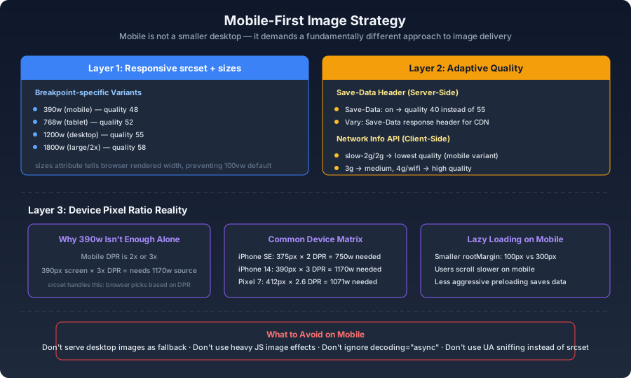
- Screen widths cluster between 375–430 CSS pixels, yet device pixel ratios of 2x or 3x push actual rendered pixels much higher
- Network quality spans from 5G to spotty 3G to overloaded coffee shop Wi-Fi
- Many users have metered data plans where every megabyte counts
- Mobile CPUs and memory are a fraction of desktop equivalents, so decode and render costs matter
Desktop-first image strategies fail on mobile because they assume abundant bandwidth and large viewports. Mobile needs its own playbook.
Responsive Images Are Table Stakes#
A 2000px image displayed in a 390px mobile viewport is pure waste — data, battery, and time:
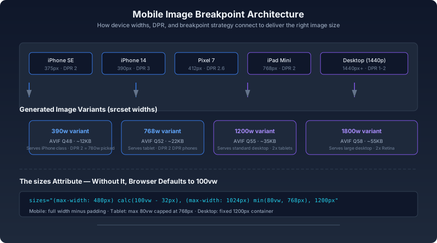
html1<picture>2 <source3 srcset="4 /img/hero-mobile-390.avif 390w,5 /img/hero-tablet-768.avif 768w,6 /img/hero-desktop-1440.avif 1440w7 "8 sizes="9 (max-width: 480px) calc(100vw - 32px),10 (max-width: 1024px) min(80vw, 768px),11 1200px12 "13 type="image/avif"14 />15 <img src="/img/hero-desktop-1440.jpg" alt="..." />16</picture>
sizes attribute is what makes responsive images actually work. Without it, the browser assumes the image fills 100vw — and on a 1440px desktop monitor, that means it picks the 1440w variant even if the image sits in a 400px sidebar. The sizes value describes the image's rendered width at each breakpoint so the browser can pick the right source from srcset.Generating Breakpoint-Specific Variants#
js1const sharp = require('sharp');2 3const BREAKPOINTS = {4 mobile: { width: 390, quality: 48 },5 tablet: { width: 768, quality: 52 },6 desktop: { width: 1200, quality: 55 },7 wide: { width: 1800, quality: 58 },8};9 10async function generateResponsiveVariants(inputPath, outputPrefix) {11 const formats = ['avif', 'webp'];12 13 for (const [name, cfg] of Object.entries(BREAKPOINTS)) {14 for (const fmt of formats) {15 await sharp(inputPath)16 .resize({ width: cfg.width, withoutEnlargement: true })17 [fmt]({ quality: cfg.quality })18 .toFile(`${outputPrefix}-${name}.${fmt}`);19 }20 }21}
Quality settings decrease with size because smaller images are viewed on smaller screens, where compression artifacts are harder to see. A 390px-wide mobile image at quality 48 looks equivalent to a 1200px desktop image at quality 55 — the perceptual threshold shifts with viewing distance and screen size.
The Device Pixel Ratio Reality#
A 390px-wide iPhone 14 screen with a 3x device pixel ratio needs 1170 pixels of image data for a full-width image. A 390w source isn't enough. But a 1200w source is overkill for an iPhone SE with a 375px screen and 2x DPR (needs only 750w). This is why breakpoint sets matter:
| Device | Screen Width | DPR | Pixels Needed (full-width) |
|---|---|---|---|
| iPhone SE | 375px | 2 | 750 |
| iPhone 14 | 390px | 3 | 1170 |
| Pixel 7 | 412px | 2.6 | 1071 |
srcset descriptor handles DPR automatically. When you specify 390w, the browser knows that on a 390px-wide screen with DPR 3, it needs roughly 1170 pixels of image data — so it picks the closest larger source from the set. The key is providing enough intermediate sizes that the browser has good options.Adaptive Quality Based on Network Conditions#
Save-Data Request Header#
Save-Data: on header. The user is explicitly asking you to use less data:js1app.get('/img/:name', (req, res) => {2 const saveData = req.headers['save-data'] === 'on';3 const quality = saveData ? 40 : 55;4 5 res.set('Cache-Control', 'public, max-age=86400');6 if (saveData) {7 res.set('Vary', 'Save-Data');8 }9 10 serveImage(req.params.name, { quality, format: 'avif' }).pipe(res);11});
Vary: Save-Data response header tells CDNs to cache separate versions for users with and without the header. Without it, the first request's version gets served to everyone.Network Information API (Client-Side)#
js1const connection = navigator.connection || navigator.mozConnection || navigator.webkitConnection;2 3function getImageQualityHint() {4 if (!connection) return 'high';5 6 if (connection.saveData) return 'low';7 if (connection.effectiveType === 'slow-2g' || connection.effectiveType === '2g') return 'low';8 if (connection.effectiveType === '3g') return 'medium';9 return 'high';10}11 12function selectImageSrc(baseUrl, qualityHint) {13 const suffix = qualityHint === 'low' ? '-mobile' :14 qualityHint === 'medium' ? '-tablet' : '-desktop';15 return baseUrl.replace('.avif', `${suffix}.avif`);16}
The Network Information API is Chromium-only for now, but it works as a progressive enhancement — unsupported browsers default to the medium-quality path. No one gets a worse experience because the API is missing.
Mobile-Specific Lazy Loading#
Mobile users scroll more slowly and over shorter distances. The lazy loading threshold should be tighter:
js1const observer = new IntersectionObserver(2 (entries) => { /* ... */ },3 {4 rootMargin: window.innerWidth < 768 ? '100px 0px' : '300px 0px',5 threshold: 0.01,6 }7);
On desktop, preloading images 300px ahead of the viewport makes sense — users scroll fast with trackpads and mouse wheels. On mobile, 100px is sufficient. The smaller margin means fewer bytes wasted on images the user never reaches.
decoding="async" matters more on mobile. Decoding a grid of 40 product thumbnails on the main thread can block interaction for hundreds of milliseconds on a mid-range phone. Offloading decode to a background thread keeps the page responsive.What Not to Do on Mobile#
- Don't serve desktop images as the
<img>fallback. If your<picture>has AVIF and WebP sources but the fallback<img>points to a 2400px JPEG, you've undermined the entire element on the one format that actually gets used on old devices. - Don't use heavy JavaScript image effects. Canvas filters, complex parallax, and CSS
backdrop-filteron large images tank mobile frame rates. Test on a real mid-range phone, not just the desktop simulator. - Don't ignore
decoding="async". On mobile CPUs, synchronous image decoding can block the main thread long enough to drop frames during scroll. - Don't use User-Agent detection to serve different images.
srcsetandsizesalready handle device selection at the browser level. UA sniffing is brittle, doesn't account for DPR, and breaks when new devices ship.
Testing on Real Devices#
- Chrome DevTools Device Mode: Switch to a mobile viewport, apply Network throttling (Fast 3G or Slow 3G), and watch the waterfall.
- WebPageTest on real hardware:
location=Dulles_MotoG4runs the test on an actual Moto G4, a representative mid-range Android device.
bash1curl "https://www.webpagetest.org/runtest.php?url=example.com&location=Dulles_MotoG4&f=json"
- Data cost perspective: If a page loads 5MB of images, that's roughly $0.015 on a typical $3/GB mobile plan. Sounds trivial — until you multiply by 100 pages per session and millions of sessions.
The Mobile-First Default#
srcset and sizes so the browser picks the appropriate resolution for the device. Breakpoint-specific variants with quality tuned to viewing distance — lower quality on smaller screens where artifacts are harder to see — deliver the right trade-off automatically. The Save-Data header lets users explicitly ask for less, and honoring it is both respectful and a performance win. Mobile lazy loading should use a tighter rootMargin than desktop; users scroll slower and less far, and preloading 300px ahead on a 375px screen wastes data. Most importantly: never serve an image larger than 1.5x the rendered size on mobile, and test on real devices under real network conditions. A Moto G4 on 3G will tell you more about your users' experience than a MacBook Pro on gigabit fiber ever will.